
9 Steps juggernaut drawing tutorial
Juggernaut (alter ego: Cain Marko) was created in 1965 for X-Men #12. He’s an empowered human and the stepbrother of Professor X. You’d have seen him in the movies ‘X-Men: The Last Stand’ (2006), and more recently in ‘Deadpool 2’ (2018).
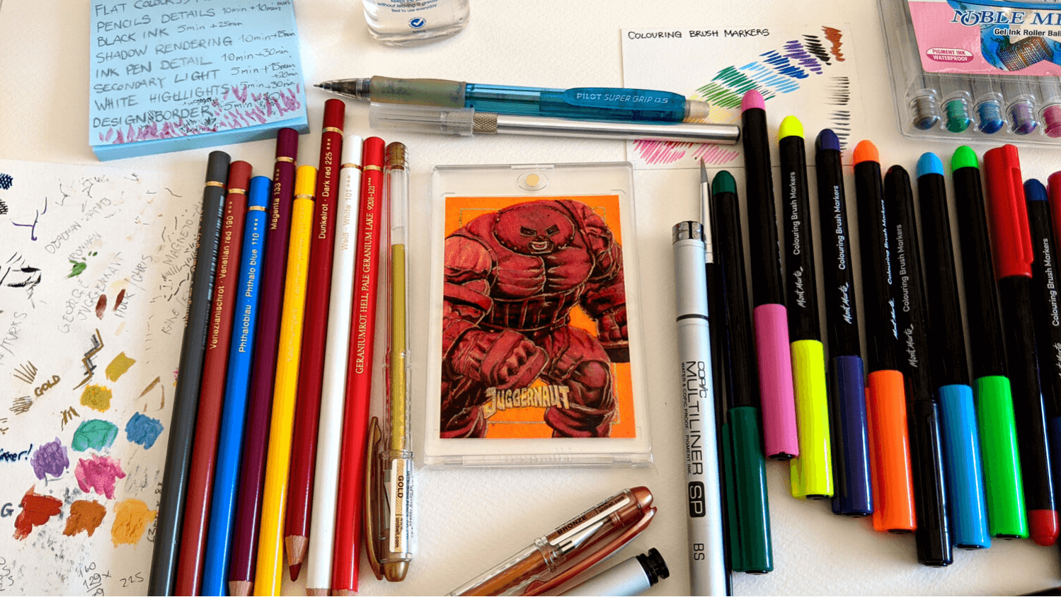
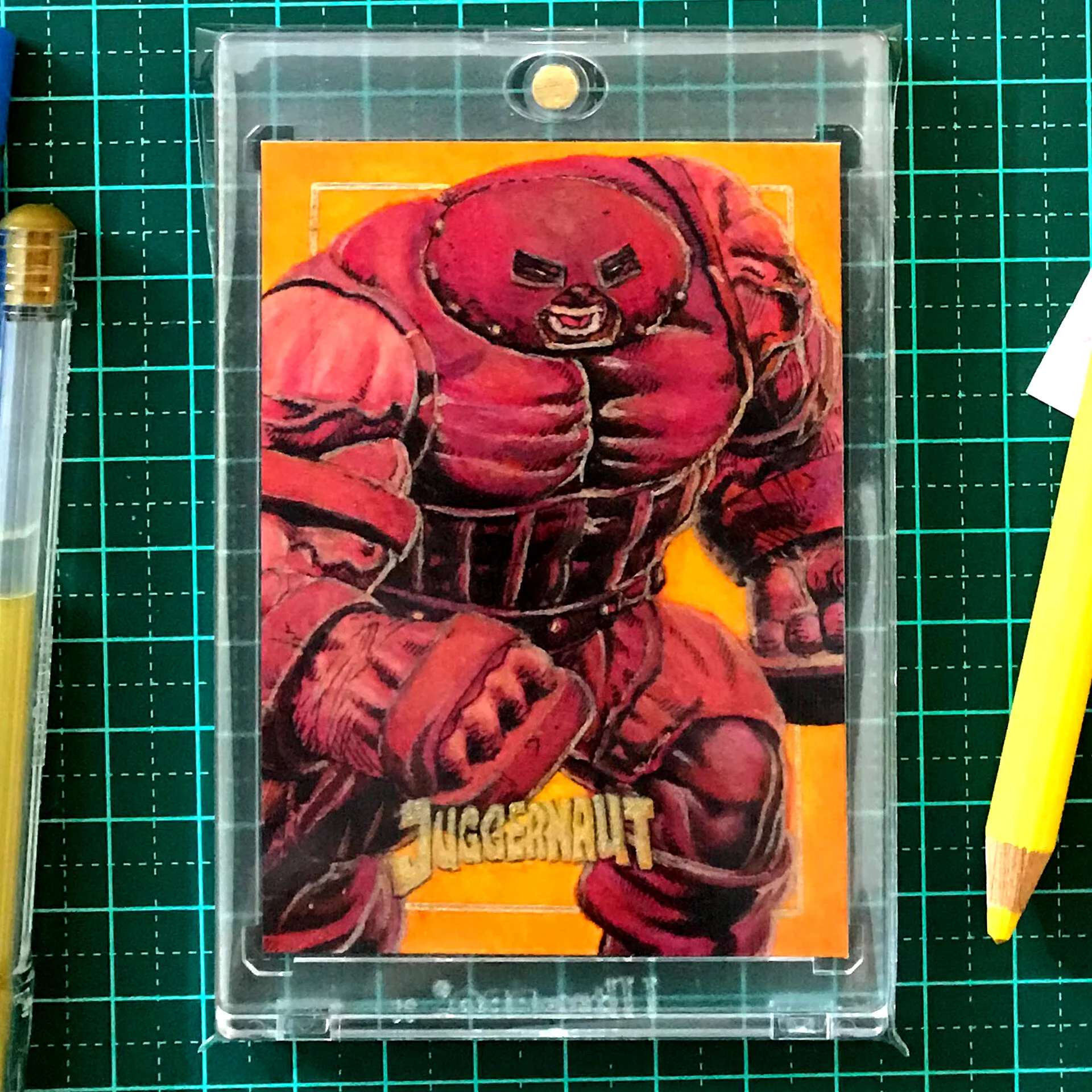
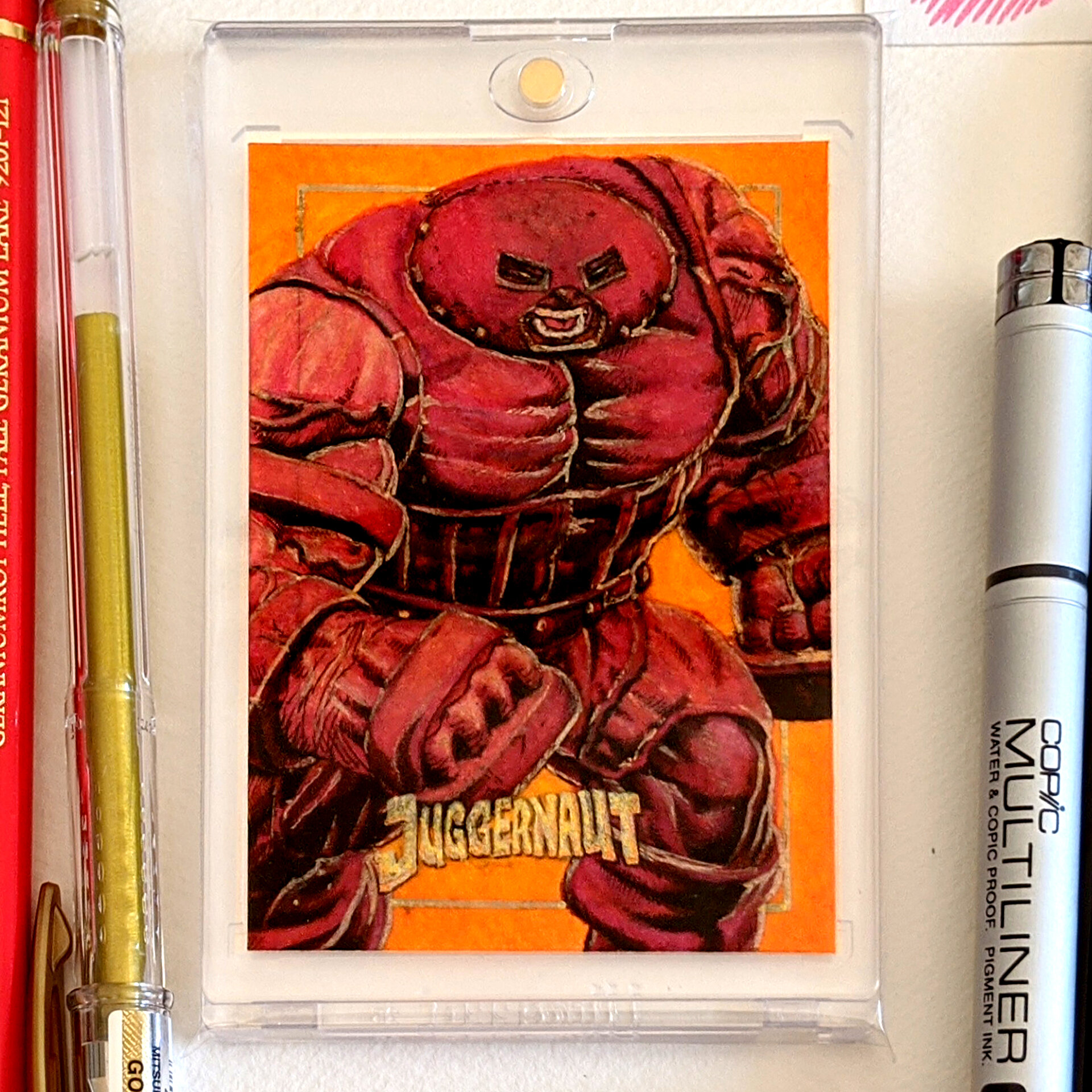
I want to share with you a sketch card that I created of this X-Men villain, Juggernaut. It’s a little different than my usual sketch card process.
Instead of using acrylic paints throughout, I separated the process by using two other mediums - Mont Marte brush markers and Faber Castell Polychromos pencils.
Here is my Juggernaut drawing work process and methodology. There is an estimated time frame with the additional time it took to finish each step and side notes on how I can improve on the next sketch card.
Juggernaut Sketch Card Process
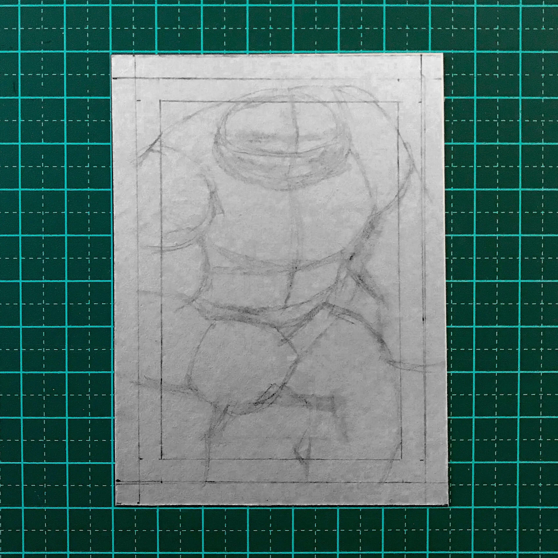
STEP 1 - SKETCH SHAPES
5min (estimate) + 5min (extra) = 10min
This first step in sketching could be the most important. When blocking out shapes and proportions it is SUPER important to get your proportions correct and or at a stage to where you are confident to move to the next phase of the drawing.
I would recommend (and I forgot to do this) was to have a break to regain fresh eyes and adjust artwork if necessary. You would be surprised the minor corrections you will need to do after just leaving the composition for at least one hour.
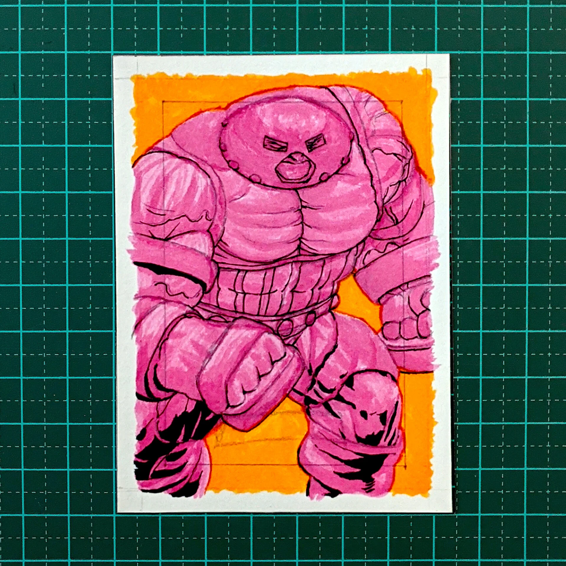
STEP 2 - FLAT COLORS
Purple orange wash
10min + 35min = 45min
This was my first time in using alcohol markers. I haver researched into maybe using copic markers and as everybody knows, that is a financial investment. As an alternative, I have tried much more affordable and locally available Mont Marte alcohol markers. What is good about Mont Marte markers is that they all come in with brush tips not the chiselled calligraphic format of copic markers.
I used this stage not only to fill in the flat colors but as I found out a second or third path with the same colored marker creates an underlayer which in hindsight I feel I wasted time in defining details during purple orange wash. I recommend you use either this stage to define the underlayer with the same marker color or block in the flat color as quick as possible and move on to the next step.
STEP 3 - PENCIL DETAILS
10min + 10min = 20min
When the flat colors have been applied, I go back to using my mechanical pencil and I add further details to the character’s costume, facial features and anatomical structure. This does not mean shading or cross-hatching or adding any lighting defining details. This happens further in the next stages.
I recommend that you be clear on this step as it is just a guideline step to define the areas of your character. Do not waste time in adding any shading or cross-hatching. A problem that I used to have.
Again I forgot to have a break to regain fresh eyes and adjust artwork if necessary.
I wasted time in defining details during pencil details.

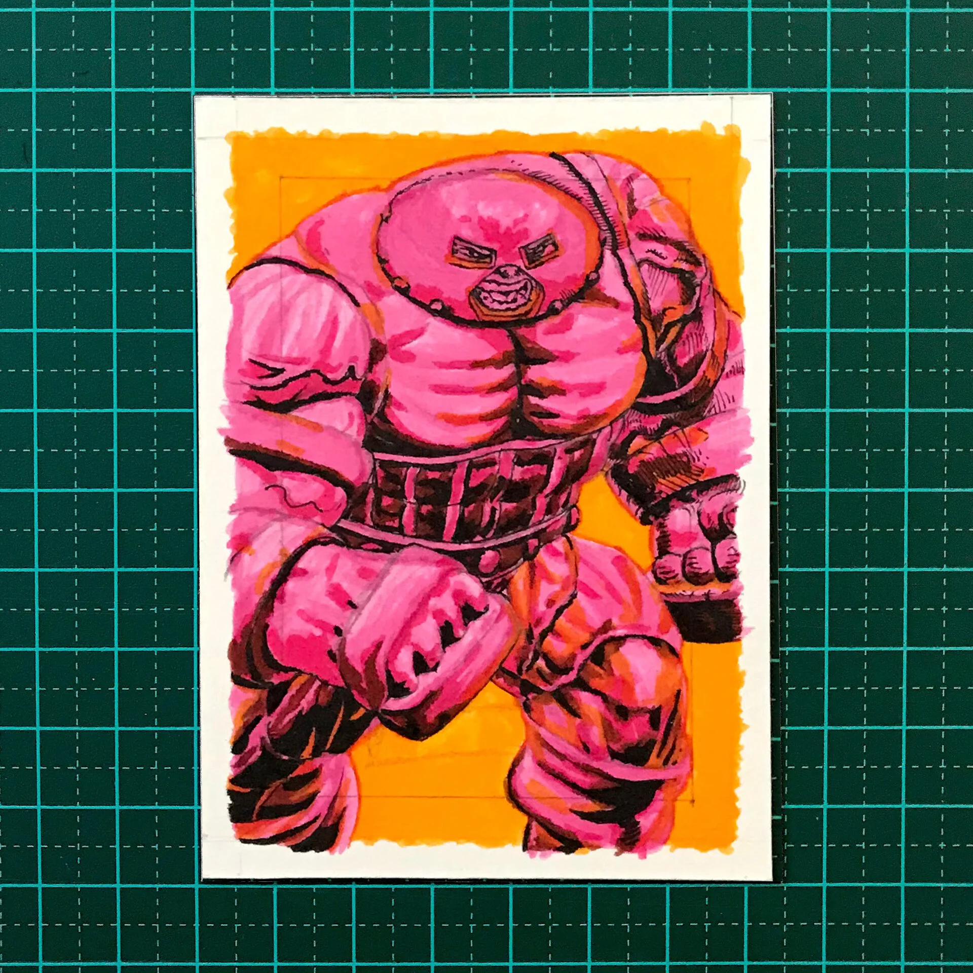
STEP 4 - BLACK INKS AREAS
5min + 25min = 30min
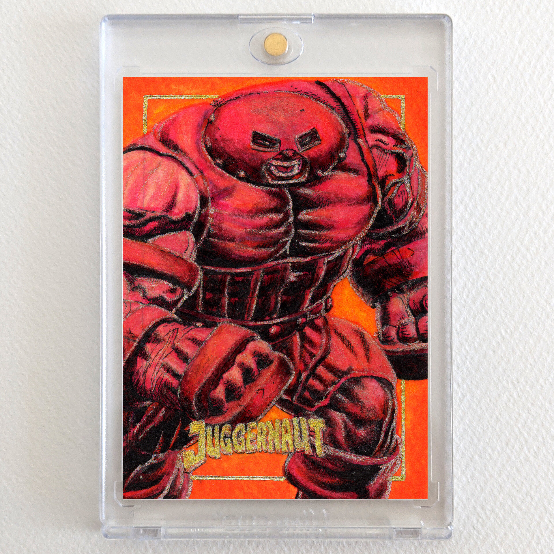
Using the black MontMarte brush and choosing in my head the directional points of the main light source - which in this case is coming from the top right of the character - I liberally add 100% black in the areas that I think would be the darkest.
Next time I will use black brush only and squint with eyes to see contrast.

STEP 5 - SHADOW RENDERING
10min + 15min = 25min.
Now comes the fun part (in my opinion). Do not forget that when using Faber Castel polychromos pencils, the pigment is wax based. So in my current process, my first chemical layout is alcohol-based. And now my middle layout is a heavier substance which is wax-based. That means I can’t add another alcoholic or acrylic paint layout on top. These are just too light of a substance.
So in saying that, polychromos pencils are some of the most vibrant colours that come out that I’ve seen so far and make my work process quite unique. By this I mean not am I only applying vibrant wax but I blend this by using a soft solvent. And I prefer using light odorless baby oil. This somehow even makes the color more vibrant.
I recommend if you choose using these substances to not forget the order in which the pigments sit on top of each other. For example, alcohol-based pigments sit on the bottom, then naturally heavier substances such as wax or oils will rise to the top. I once made the mistake of applying acrylic paint on top of polychromos pencils. The paint did not adhere to the surface at all. Massive fail!
I’ve used Polychromos pencils for shadow rendering, light use of black

STEP 6 - INK PEN DETAIL
10min + 30min = 40min
Another first for me is using very fine felt-tipped pens. I chose to use a Copic Micro 0.01 black pen. This made a world of difference in rendering and controlling the accuracy of defining details such as cross-hatching. Luckily the black ink sat comfortably on top of the wax polychromos pencils. Using such a fine pen, I was able to create the veins and muscles showing the tight striations on the character’s body.
I use a 0.01 Pen for details. I highly recommend you invest in and try a pen that’s below 0.1 mm. When working at this size, the more control you have the easier it is for you in the long run.
STEP 7 - SECONDARY LIGHT SOURCE
5min + 15min + 20min = 40min
Adding this step is quite new in my process. When thinking of adding a secondary light source, you’d usually want it to be on the opposing side of the main initial light source. And already in my mind, I wanted the whole artwork to have a feeling of heaviness and weight.
So not only was this condition appropriate to use when the character’s costume color is a warm burgundy brown, I complemented this by adding a yellow / orange pumpkin color. Knowing this, I wanted the secondary light source which was a vibrant orange, to be coming from the back of the character. This to me conveys warmth and heaviness. Attributes complementing the character.
STEP 8 - WHITE HIGHLIGHTS
5min + 30min = 35min
At this time, I had not purchased a suitable white highlight that could sit on top of the heavy wax polychromos pencils. So instead I went ahead and chose to use gold as my highlighter. In hindsight this choice was much better that using a literal white highlighter.
A tip on this idea of using a highlighter, you’d want to find a substance that is again heavier than the wax polychromos layer. I have chosen to use a heavier substance that is termed jelly, specifically Uni-ball Signo White Jelly Pens. This jelly substance on top of the wax seems to be perfect.
STEP 9 - DESIGN TITLE AND BORDER
5min + 10min = 15min
Another fun part of my process. What I think is quite unique in my sketch cards is that I apply a border and the title of the character as the design of the piece. Some fun things I like to do is for the character to step over the border or be in front of the frame.
And especially for this character, I wanted everything to look cramped. In showing this, I put the borders in the background, the character filling up all of the space as much as possible and uncomfortably fitting the title between the character’s legs.
I recommend you use these types of fun ideas in your own artworks. Whether it’d be giving context to the character by your choice of composition, your choice of colour which conveys mood or weight. These choices give an extra detail which your client or patron will appreciate. More extra shadow rendering - 15min.
Conclusion
I’m going to adopt this process in my next sketch cards. I love how the alcohol-based markers sit comfortably underneath the vibrant wax polychromos pencils and how I’m still able to add detail on top with microfiber pens. Finding a heavy white highlighter that can sit on the top layer is a breakthrough in my sketch card creation. I took me roughly 5 hours in total to create this Juggernaut - X-men Villain sketch card. I think I could shave off 1 hour to create a full coloured sketch card.
If you find my content valuable and/or you’d like to support my work, you can go to my Buy Me A Coffee page. This will help pay for this website and my art supplies.
Liked this article? Check out my other tutorials:
Drawing Thor Using Charcoal And Ink